UPDATE - the full book is available from the Whipple Museum as a Free PDF Download. I urge you all to have a read of it. Many thanks to the staff at the Museum for making this happen!
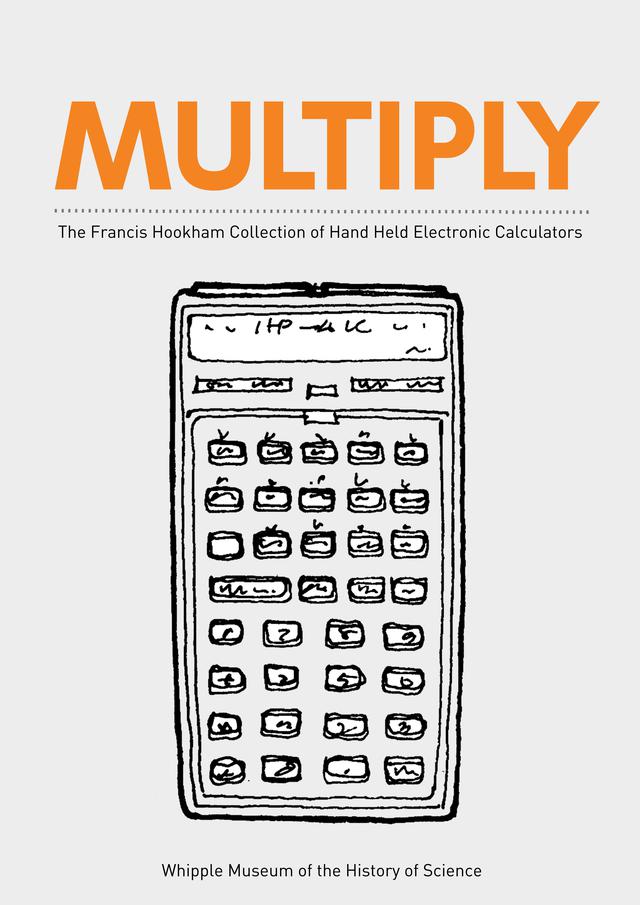
When I first met the lady I would eventually marry, she told me that she'd started work on a book about a collection of calculators. For various reasons, over the next few years, the project would lay dormant. When the pandemic hit and the UK went into the lockdown, we decided to spend the time to finish the book and get it published. The book covers the collection of Francis Hookham, held at the Whipple Museum of the History of Science in Cambridge. Back in the day, Francis Hookham realised - rather insightfully I think - that calculators wouldn't be around for very long, so he started collecting them. Eventually, his collection became too large, so he bequeathed it to the museum.
Sometime later, the collection was catalogued, measurements and photographs taken - even the feel of the keys was recorded. This dataset formed the basis of the book - 'Multiply'. I picked up where the original designer left off - with a collection of ideas on the basic layout, look and feel. The book was envisaged as a catalogue - a sort of top trumps affair. Key stats for the calculators would be presented underneath a photo, with some cool looking glyphs representing the keys. In between the various pages of the collection, there would be some - gasp - full page spreads as well as some history about certain objects and what they say about the time they were in use.
Now, by trade I'm a software engineer and a trainee scientist - I've never designed a book before. However, I'm no stranger to graphic design, having done a variety of things before now. But a book is a new proposition with different challenges. There was a lot of work ahead. But where to begin?
The collection spans over 400 calculators! That's an awful lot of cropping! The images are quite large - they need to be in order to printed at a high dpi. There was no way I was going to hand crop all the calculators in this collection. However, there was no money available really for getting this project finished. So I decided to have a look around at some opensource tools.
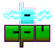
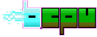
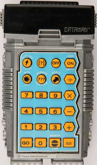
I managed to find one called Mask-RCNN. This lovely little program uses the power of AI (evil-chuckle!) to perform cropping with some awareness of what is in the image. For the vast majority of images, it did a really good job! Some of the calculators didn't come out too well, but in these cases, I just broke out either the GIMP or Krita and cropped by hand. The worst by far was the dataman - all the damn crinkley edges! Well, that and the calculator security boxes with their cables casting shadows! Nevertheless, this whole step was a lot less painful than I thought it would be.
I quite like the poetic, ironic beauty of an advanced piece of technology working hard to crop out pictures of an earlier, now defunct (sort-of) technology. Like someone cutting out pictures for the family album.
Now that we have the images ready, it was time to start laying out the datapages. These would all follow the same design language. Consistency but also not shying away from exceptions to the rules if it looked correct. I don't have any of the Adobe tools and although I could have gotten some sort of student discount, I'm sure there would have been a legal block to that avenue. So I looked again at the free tools and settled on Scribus. Apparently it's used by a newspaper in India which bodes well, I guess? Aside from that, I didn't really know anything about it, or desktop publishing. I can't remember the last time I used a DTP package. Probably on a really old PC or Amiga.
Scribus works a bit different to word processing packages. Certain things began to rub me the wrong way straight off the bat. Firstly, selection is total, meaning that if you want to select an item, you must drag a selection box around it completely, which is totally different to how almost every other program works. Secondly, the way the tools are organised takes some getting used to. Third, I couldn't get the darn templating to work. This meant the layout is slightly different on every page!. Nightmare! I had to go back and check all the boxes and pictures and what not, manually typing in the dimensions to make sure they were correct. If anyone knows how to get templates working nicely in Scribus do let me know. The documentation is very little help in this regard.
One thing I will say in Scribus's defence - at least on the Linux version - is that it handles very large documents very well. The catalogue pages of the book alone were coming in at over 10G! I'd scaled down most of the images to be at least 600DPI for printing. At roughly 4 x 6 cm across for the most part, at 600DPI that comes in at at 130000 pixels. So no wonder then really.
Later on, we would need to change the images to be a bit smaller. Another nice feature of Scribus comes in - the support for Python scripts. Scribus has a reasonably intuitive interface to trawl all the elements of a document and process them with some code. This proved invaluable when I needed to change all the image filenames to the new smaller images. Not only that, I could change certain bits of the text, remove empty elements, all sorts of things that you couldn't really do with a search and replace. It saved a lot of time.
The data-pages took a very long time, or at least it seemed that way. Every Wednesday night for at least 6 months, I'd do a few hours cutting and pasting from a spreadsheet, inserting an image, checking it was all correct, then moving along. In hindsight, if I'd have gotten the templating right, I could have automated a lot of the process. There are only a few pages where the form is broken - typically for wide and extra chonky calculators. If I ever do this sort of thing again, I'll do a bit more checking on how I can script it all and relax as the machines do the work!
All in all, Scribus did a good enough job. Once I'd gotten my head around it's quirks and reminded myself it isn't a word processing tool, things went better. It's SVG support on the other-hand....
Yes, I'd wanted to use SVGs for the little button glyphs. All the functions of the calculators in the collection are recorded, with each one represented by a little icon. The icons are designed to look like a calculator key but also be clear. I decided to use Inkscape to do the design which worked well enough. The problem is that Scribus wouldn't import the SVG properly. I've no idea why, so I had to settle on exporting large PNGs, shrinking them down inside Scribus. It's not ideal really, but it seemed to come out okay in the printing.
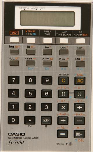
Of course, what everyone wants to know is which calculator has the most functions? Well, I can tell you it's... well, there's a few that tie for the top slot, but one of them is the Casio fx-7100.
The book isn't just a catalogue. There's quite a few words describing the collection, how it helps us understand a particular period in time, as well as a number of related objects like adverts and guides. Some the calculators in the collection are given special treatment, with a one or two page spread. This is largely because they have something specific to say. One example is the page on Sinclair where the Sinclair Executive is picked - the story being that calculators could be considered stylish, and seen as status symbols in some cases (we deliberately avoided printing a particular advert for the Sovereign from the 70s. It was a bit risque shall we say). The Little Professor gets a page because it says a lot about how calculators were thought about in terms of education, and because of the nostalgia many people of a certain age have for it.
Designing the feature pages was a little trickier and took a bit of a design eye to get right. Some of them I'm still not happy with but I'm not sure exactly how I'd improve them. The images set the restrictions - a couple of the pages such as the one on tax and VAT were a particular challenge.
Once the catalogue and feature pages were done, we started the process of proofing. We decided to go old-school and print out the proofs on paper. I'd look at the whole document, then Katie would look at it, add her markup then I'd go and fix whatever we'd found. For the most part, the proofing went fine. We did two rounds of proofs that took a couple of weekends to sort. Not too bad. I'm sure there will still be something we've missed but there always is I gather.
Printing was a little trickier. I needed to set some crop marks and bleed. Bleed refers to the area outside where the page will be cut. Anything that needs to be full page, from edge to edge, needs to extend into the bleed. This gives a margin of error when the page is cut. The resulting PDF has pages that are slightly bigger than A4, with the relevant pictures extending into this area. Marks are added so the printer knows where to cut. This took a bit of time in Scribus. I got it wrong the first time - not quite managing to get the pictures to extend into the bleed. Nevertheless, I got there in the end after doing a lot of googling.
I designed a total of 4 different covers before we settled on the final version. I used Krita for the majority of the work - it's a little easier to use than the GIMP I've found. Feedback from the various parties we asked was mixed. The final cover I felt was the most interesting, featuring the drawing Francis Hookham drew himself as part of the little cards he'd give to people asking them to donate their unused calculators. The drawing aesthetic doesn't quite fit the tone of the book however, so I tried to tie it in with the colour scheme and the underlining. I think the final result looks pretty good.
The back cover has all the things you'd expect, with some nice quotes. I really wanted to put "Look at these absolute units!" on the back but this was vetoed! :D
I'm sure we'll get some comments from pedants along the lines of "well, actually, I think you'll find the Speak and Spell is not a calculator" or "The Curta is not an electronic calculator! How dare you!". Well, maybe I've been jaded by the internet? I think it's nice that we can see a bit of an evolution, the grey edges of this defined corner of electronics. The Speak and Spell feels like a cousin of the calculator in some ways. The earlier mechnical calculators give us a glimpse into the pre-electronic days, and the Soroban shows us a totally different take on calculation. The Soroban in particular serves as a useful contrast object - it highlights that electronic calculators were only one way of doing arithmetic and that this problem has been around for a long while.
The security cradles tell a side of the story very directly - calculators were expensive. I suppose one can see the Kensington lock as a natural progression?
Some folks really go to town on Easter eggs in books. Little puzzles and things for the eagle-eyed to spot. I regret not putting any such things in, especially in a book like this. However there are a couple of nice design choices. The front cover is a drawing Hookham made of the calculator he used, which appears on the very next page in the same space as you turn the page. The spread on the Bowmar is designed to highlight how the manual looks almost the same as the calculator itself. But my favourite little cheeky thing is this...
I managed to sneak in Comic Sans giggle
Yep, points will be awarded if anyone can spot where Comic Sans has been used. I'll give you clue - it is everywhere and it is nowhere. Stumped? Okay another clue. It's more likely to be around the more complicated calculators.
Yes, from the Museum only at the moment. If it sells well maybe there will be another run. It has an ISBN number and apparently Amazon do tend to trawl the newly issued numbers, putting things up on their site pretty early on. Print on demand could be an option, but there might very well be a digital version on the way. I'll need to tidy things up a bit, shrink down the images to make it viewable by most programs, but it should be online fairly soon.
All of this has happened at a difficult time. Francis Hookham passed away fairly recently, as did Clive Sinclair (who we had hoped to interview for the book) and the head of the Whipple Museum has just retired. Not to mention all of the time I spent on the book was during the worst parts of the pandemic. The book itself has a lot of nostalgia value; while I was never a massive calculator fan, the collection transports me back to a time around the early to mid eighties, when such items were commonplace. I don't know how Hookham knew these things would burn brightly then disappear but I'm really glad that he did. It's been an honour to work on the collection.